Main: Trailer
Ancillary Task 1: Magazine Cover
Ancillary Task 2: Poster
Showing posts with label Poster. Show all posts
Showing posts with label Poster. Show all posts
Tuesday, 29 March 2016
Thursday, 24 March 2016
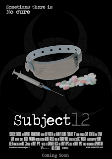
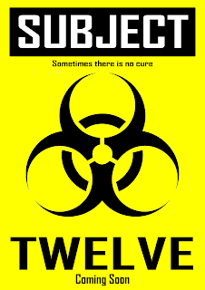
Final poster
After having problems getting the right props to use my own photos i was forced to source one of the photos (the wristband) from the internet. As i finished this poster close to the deadline i did not have a lot of time to organise a focus group. I was stuck between the format of the title and after asking a few people they decided that the second, overlapping title looked better.
These were the 2 options:
1. 2.

These were the 2 options:
1. 2.

Tuesday, 2 February 2016
Timeline Update
Date Task
29/11/15 Plot Finalised
7/12/15 Story board of trailer
12/12/15 Location and mise en scene planning started
15/12/15 Script began
17/12/15 Casting complete
20/12/15 Production company idents started
28/12/15 Begin ancillary product planning
10/1/16 Start constructing ancillary products
16/1/16 Begin filming
28/1/16 Start editing
7/2/16 Ancillary products first draft complete
10/2/16 Audience feedback on ancillary products and start making improvements
14/2/16 First edit complete
17/2/16 Begin production of sound/music
20/2/16 Audience feedback on trailer and start make improvements
25/2/16 Ancillary products finished
29/2/16 Final trailer complete
Monday, 18 January 2016
Poster ideas
On the left are some very rough ideas for film posters and on the right are Photoshop mock ups of the ideas. To keep some continuity between these poster ideas i kept the biohazard sign.
1) This poster idea is a teaser poster as it doesn't contain any information about the cast and doesn't give anything away about the plot. This poster is styled after a biohazard/caution as one is displayed in the trailer. If i were to choose this poster i would improve it by adding a film website and my idents as they feature in teaser posters as well as theatricals yet they are not included in this draft,


2) This is a theatrical mock up of the poster design. The font used was chosen because it resembles that of the text on a prescription or on a doctors note.
I have chosen to further develop the second poster. To improve this i will have to photograph the props myself as the ones in this mock up were found on the internet.
1) This poster idea is a teaser poster as it doesn't contain any information about the cast and doesn't give anything away about the plot. This poster is styled after a biohazard/caution as one is displayed in the trailer. If i were to choose this poster i would improve it by adding a film website and my idents as they feature in teaser posters as well as theatricals yet they are not included in this draft,


I have chosen to further develop the second poster. To improve this i will have to photograph the props myself as the ones in this mock up were found on the internet.
Poster research

After researching posters i have decided that i will be creating a theatrical poster as the theatrical poster is often released shortly after the teaser trailer so i feel it would be fitting to do this as it follows the conventions of film and poster releasing.
Monday, 12 October 2015
Film Poster Analysis- Paranormal Activity Theatrical Poster
Paranormal Activity is a 2007 American found footage supernatural film. It is the first out of six in the franchise.
The poster has a simplistic colour scheme which includes the colours black , white, blue and red. All the colours are dark and gloomy and represent the horror genre. The red and black could signalise danger or death. The use of the black back ground and because the whole poster and main image is really dark it could suggest that the film is mainly set at night. This adds to the fear factor because people think of the night as the scariest time as you don’t know what can happen to you when your in the dark. The white text creates a 'ghostly' feel which is relevant to the demon/possession theme. The colour blue in the text and the blue shade across the image not only highlights the night vision of the camera but also suggests a cold and chilling atmosphere which is often associated with the supernatural and ghosts.
The title is written in a text that is larger and in a different colour compared to the other text on the poster, this enables the title of the film to stand out. Also, the blurriness and glow of the red title reminds the audience that the film is based on video footage. Similarly, most of the text uses capitals suggesting an intimidating tone which again is fitting to the horror genre.
This poster breaks a few conventions as the main image only takes up a fraction of the poster, it fails to include the production block and release date. But it does follow the conventions of the colour schemes, slightly revealing images, hints to the genre and film content.
Film Poster Analysis- Saw 2 Theatrical Poster
Below i have embedded a slide share of a pdf analysing the theatrical poster for saw 2. I have analysed this to further grasp the makings of a horror film poster and to help me create a realistic and professional film poster for my brief.
Film Poster Analysis- Sinister Theatrical Poster
Sinister is a 2012 american supernatural horror film. This is the theatrical trailer.
The main image in the poster shows a little girl who has drawn a demonic face out of blood on the wall and this with the tagline 'Once he sees you, you cant be saved' creates a fearful and horrific atmosphere. From this we can guess that the face on the wall is the main character/creature causing the distress. Her Slumped pose makes her look semi-conscious as if she has been possessed. Also the way she is young and creating an image on the wall represents the idea that she is playing some sort of game, or she is allowing everyone else to see what possesses her. Below the demonic face is a broken reel of film, this suggests that the demonic creature/character was released or awoken from the film reel.
Unlike other horror posters, the background colours are light which juxtapose the typical horror conventions.
Although the colours are much lighter the colours are dull and grim which contrast the blood image and makes it stand out. Also the cracks on the corners of the walls suggests that there is a demonic presence that is slowly consuming the girl. The colours play a big influence in the poster. For example, red suggests blood and death, the white is representing the innocence and purity of the little girl and black shows the darkness and a worn emptiness effect distinctively showing the audience that this is a horror film poster.
For the masthead the font is typically creepy as the title has a reflection around the letters that has been faded, this effect makes it look spooky and scary, it suggests to the audience that there might be ghosts or a demonic presence in the film and there will be mysterious things going on. In addition the front reflection looks like as if blood or ink is dripping down from the letters, this connotes that there might be a lot of blood, death and killing involved which shows the audience the genre again.
For the masthead the font is typically creepy as the title has a reflection around the letters that has been faded, this effect makes it look spooky and scary, it suggests to the audience that there might be ghosts or a demonic presence in the film and there will be mysterious things going on. In addition the front reflection looks like as if blood or ink is dripping down from the letters, this connotes that there might be a lot of blood, death and killing involved which shows the audience the genre again.
Other than the background colours and the revealing light the poster follows the main codes and conventions of horror film posters.
Tuesday, 29 September 2015
Ancillary Products: Keys and Conventions (Unfinished)
Below i have explained the codes and conventions of the ancillary products in my brief and why i have chosen them. The ancillary products i can choose from are:
Website Homepage
Film Magazine Front Cover
Film Poster
- A website homepage for the film
- A film magazine front cover
- A poster for the film
Website Homepage
Film Magazine Front Cover
Film Poster
I am going to create the poster as one of my ancillary products. I believe a poster is effective and reflects a film well through how it utilises genre conventions and presenting information.
It effectively presents the themes of the film and gives some insight about the film through quotes and reviews which would appeal to a viewer and reassure them of the films worth. I also believe that the many forms and places a poster would expose the film to a large amount of people.
Subscribe to:
Posts (Atom)


